2 June 2026
Richmond, London
Design Notes No. 01
Robo
Sometimes a design decision comes down to a single letter.
I chose Aboreto for the ROBO logo because its R caught my eye. Its curves have something almost human about them, while the sharper, more geometric details give it an unexpected precision. There's a tension between the organic and the engineered that felt right for ROBO.
We're interested in the space between technology, nature and human imagination. Aboreto seemed to occupy that space, too: decorative without being delicate, structured without feeling mechanical. It didn't look like the obvious choice for a robotics publication, which was precisely the appeal.
Sometimes a visual identity starts not with a set of rules, but with recognising something that feels right.
2 June 2026
Richmond, London
Design Notes No. 02
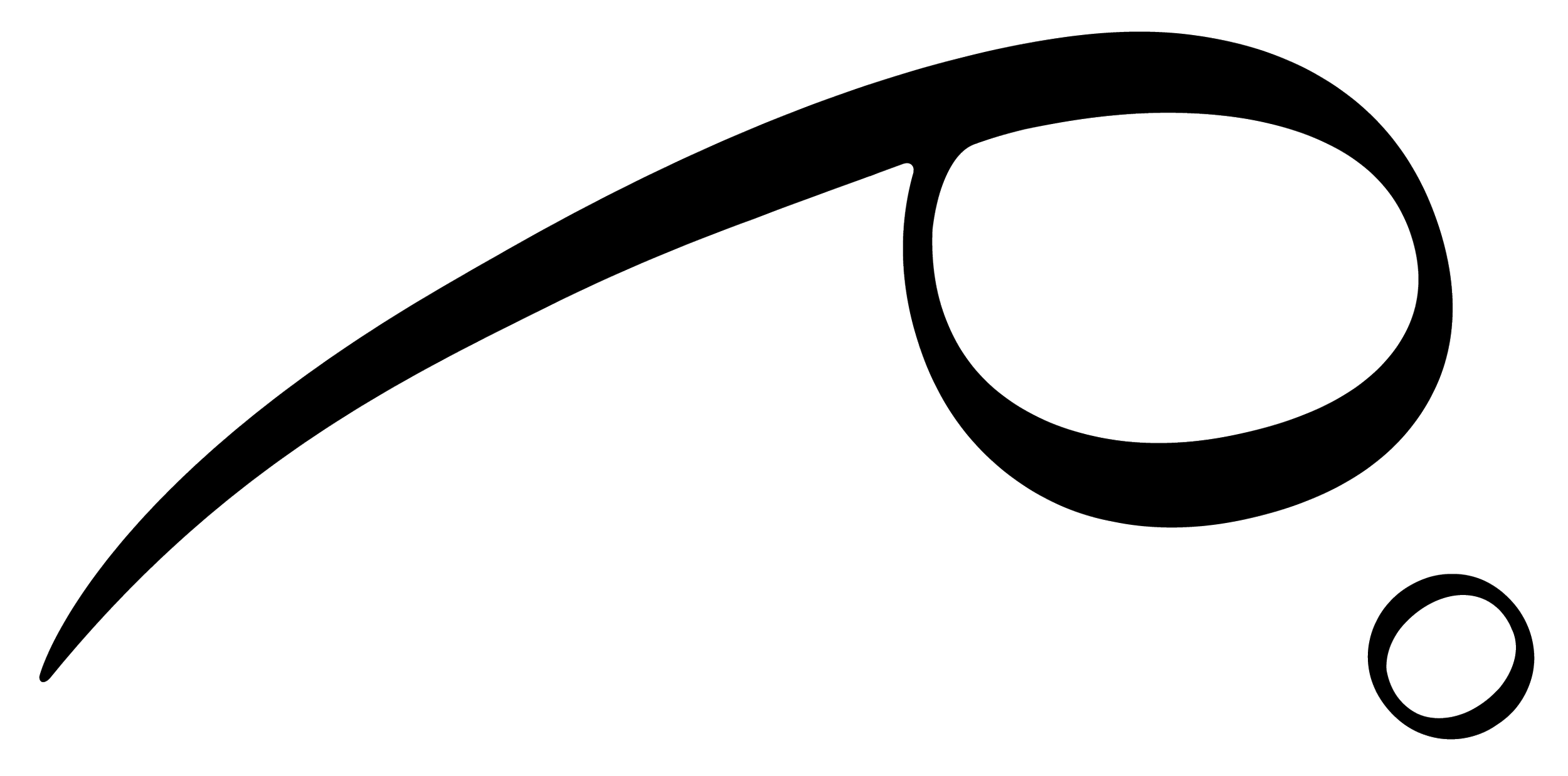
Finding the form: the thinking behind Rho0
When we began thinking about the name for our robotics venture, we wanted something simple: a letter, a number, a symbol. Something with the immediate recognition of a Nike tick, but with enough depth to reward a closer look.
The Greek letter rho felt like a promising starting point. It has a visual simplicity that appeals to me as a designer, but it also has a direct connection to robotics through its first letter, and a personal resonance with Tom that made it feel right. In physics, rho is used to represent density; in electrical engineering, it can represent resistivity — a property that connects to the very materials and systems that make robotics possible. Row is also my maiden name.
The more I explored, the more the symbol began to open up. Its shape suggested movement: a single, graceful stroke, sweeping upwards before curling back on itself. Almost an animal leaping forward. A mark that could feel both precise and alive.
Then came the zero.
In scientific notation, rho with a subscript zero can represent an initial or reference state. In computing, zero and one form the foundations of binary. Suddenly, Rho 0 seemed to hold the idea of a starting point: a place from which something new could emerge.
That felt right for a company exploring robotics not simply as a technology, but as a cultural force — bringing together engineering, ideas, people and creative possibilities.
There is something satisfying about a name that works on several levels. It needs to be clear enough to recognise, distinctive enough to remember, and open enough to develop into a visual identity. But it can also carry a private history, a scientific reference, or a meaning that only becomes apparent through exploration.
I don't think every design decision needs to be loaded with symbolism. But sometimes the symbolism is already there, waiting to be found.
Fri 9 October 00:49
Richmond, London
Design Notes No. 03
Choosing a typeface for print
I've spent a lot of time looking at fonts. It's easy to get lost in the sheer number of possibilities, but I'm not just looking for something that looks good. I want the design of ROBO to have a logic of its own; for the decisions we make to mean something, even when that meaning isn't immediately obvious.
I kept coming back to Minion Pro.
Designed by Robert Slimbach for Adobe, Minion was first released in 1990, drawing inspiration from the humanist typefaces of the Renaissance. Its forms look back to a time when the printed word was still a relatively new technology, and when the craft of making letters was inseparable from the movement of the human hand.
What interests me is the journey from there to here. Minion was developed for digital typesetting, bringing the character of historical printing into a new technological era. It carries something of the past into the present without feeling like a relic of it.
That feels right for ROBO.
We're interested in what happens when technology begins to challenge our ideas about intelligence, creativity and what it means to be human. But the future doesn't exist in isolation from everything that came before it. Every new invention inherits something from the world that made it possible.
I also simply love the way Minion looks on the page. Its curves feel soft and considered, its letterforms have warmth, and it has the kind of quiet confidence that lets the words take centre stage. I want ROBO to be something you can spend time with: a publication to read slowly, return to, and keep.
Choosing a typeface might seem like a small decision. But a magazine is made up of thousands of these decisions, each contributing to how it feels as an object and how it communicates its ideas.
Minion felt like the right place to start
Fri 9 October 01:34
Richmond, London
Design Notes No. 04
Choosing a typeface for online
One of the things I've been thinking about while building the ROBO website is how to carry the magazine's visual identity into a digital space.
My instinct was to use the same typeface everywhere. If Minion Pro is right for the printed magazine, surely it should be right for the website, too?
Not necessarily.
Print and digital have different demands. In print, the texture of the page, the quality of the paper and the way ink sits on a surface all contribute to the reading experience. On screen, we're working with light, pixels and an almost infinite variety of devices and viewing conditions.
I've been experimenting with different typefaces in the website's design settings, looking for something that retains the warmth and character I want for ROBO but feels comfortable to read on screen.
I tried Bodoni Moda, which has a beautiful, high-contrast elegance. But across longer passages of text, its fine strokes and sharper details began to feel a little harsh. I wanted something softer, with more generous forms and an easier rhythm for reading.
I found that in Newsreader.
Designed for reading on screens, Newsreader has the character of an editorial serif without feeling like a reproduction of an older printed typeface. It feels contemporary, but not cold; considered, but not overly polished. Most importantly, it invites you to keep reading.
So the current plan is Minion Pro for the magazine and Newsreader for the website.
They aren't identical, and that's the point. I'm not trying to reproduce the printed page on a screen. I'm trying to preserve the same sensibility across two different experiences.
ROBO is interested in the relationship between the human and the machine, the physical and the digital, the things we inherit and the things we invent. It seems fitting that its typography should reflect that balance, too.
Sometimes consistency isn't about making everything the same. It's about knowing what matters, and carrying that through in different ways.
Sunday 918 October 03:52am
Richmond, London
Design Notes No. 05
From Magazine to Journal: Finding ROBO's Voice
At some point in the process of building ROBO, the word magazine stopped feeling quite right.
It wasn't that there was anything wrong with it. But it carried certain expectations: something current, something to read, something that arrives on a schedule and makes way for the next issue. It felt a little too close to the newsstand, and a little too far from what we wanted to create.
We wanted to make something people would keep.
ROBO has always been interested in robotics as more than a technological discipline. We're interested in the questions that emerge around it: intelligence, creativity, consciousness, art, music and what it means to be human. We're interested in the machines themselves, of course, but also in the ways they change how we see ourselves and the world around us.
That kind of exploration needs room to breathe.
The word journal began to feel more appropriate. It suggests a record of thinking, a collection of observations and enquiries that accumulate over time. Something considered rather than hurried. Something to return to, rather than simply catch up on.
It also gives us permission to approach the subject differently.
Not every piece needs to report on the latest development or arrive at a definitive conclusion. We want to make room for the exploratory essay, the personal reflection, the philosophical musing and the unexpected connection. Sometimes an idea is worth following precisely because we don't know where it will lead.
This became a useful way of articulating what we wanted ROBO to be:
ROBO is a space for thinking as much as knowing. We welcome writing that explores, questions, wanders and makes unexpected connections. Not every essay needs to arrive at an answer. Some ideas are worth following simply to discover where they lead.
The shift from magazine to journal doesn't mean abandoning journalism, engineering or the people building the technology. Those remain essential to what we do. It means placing them alongside art, culture and open-ended enquiry, allowing each to inform the others.
Visually, it reinforces our commitment to the printed object: considered typography, tactile materials and an approach to design that values longevity over novelty. We want each edition to feel like part of a growing collection, with a life beyond its publication date.
We're not interested in predicting the future of robotics so much as exploring what it might mean.
ROBO is an independent journal of robotics and culture.
It's a small change in language, perhaps, but it gives us a much clearer sense of the space we want to occupy — and the freedom to discover what belongs within it.